Nature & technology
The story of Holmen begins where the power of the forest meets the ingenuity of human engineering. Here, where nature and technology intersect, incredible opportunities to create a sustainable future unfold.
The new Holmen brand is built from a simple, captivating narrative forming the basis for everything. From every key message to the final anchor point in the new typeface. In close collaboration with the Holmen team we have created a visionary brand ready to inspire a broad audience about Holmen’s circular business ecosystem and the immense potential of renewable products from the forest to drive the transition towards a sustainable future.

Logotype & typography
Holmen's logotype has contrasting sharp and rounded corners. The sharp corners represent technology while the round corners embody nature.
'Holmen Tree' and 'Holmen Plant' are monospaced, uppercase typefaces born from the new logotype. The shapes are designed to fill a square and have a grid-like appearance. Some letter shapes have wider alternatives that can be used to create a better rhythm in text. The character sets also supports over a hundred languages.
The dynamic 'H'
The ‘H’ is a branding tool that can be used instead of the Holmen logo. The responsive ‘H’ can be used in varying proportions but always within the Holmen grid.

Colour palette
Holmen’s colour concept is inspired by the fusion of nature and technology. The calmer colours represent nature while the vibrant colours signify technology.


Functional Icons & descriptive illustrations
Holmen's functional icons are based on the custom display typeface with sharp and rounded edges. The icons are built on a grid with consistent line thickness.
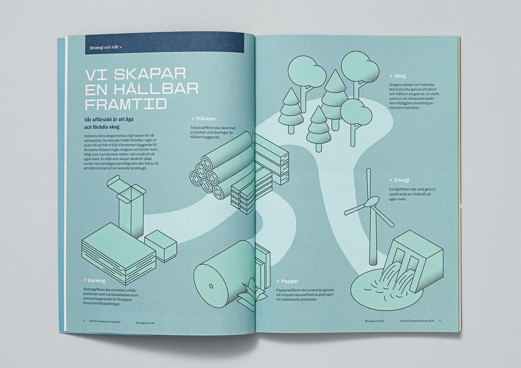
The descriptive illustrations are intended to be used when Holmen needs to describe details and processes. The illustrations are always based on an isometric perspective and are clear, explanatory and clean.

The abstract 3d illustrations are used as an alternative to photography in situations where business areas need to be strengthened.
Holmen's imagery is photographed in natural environments with magical light.
