A geometric sans inspired by the art of Calder
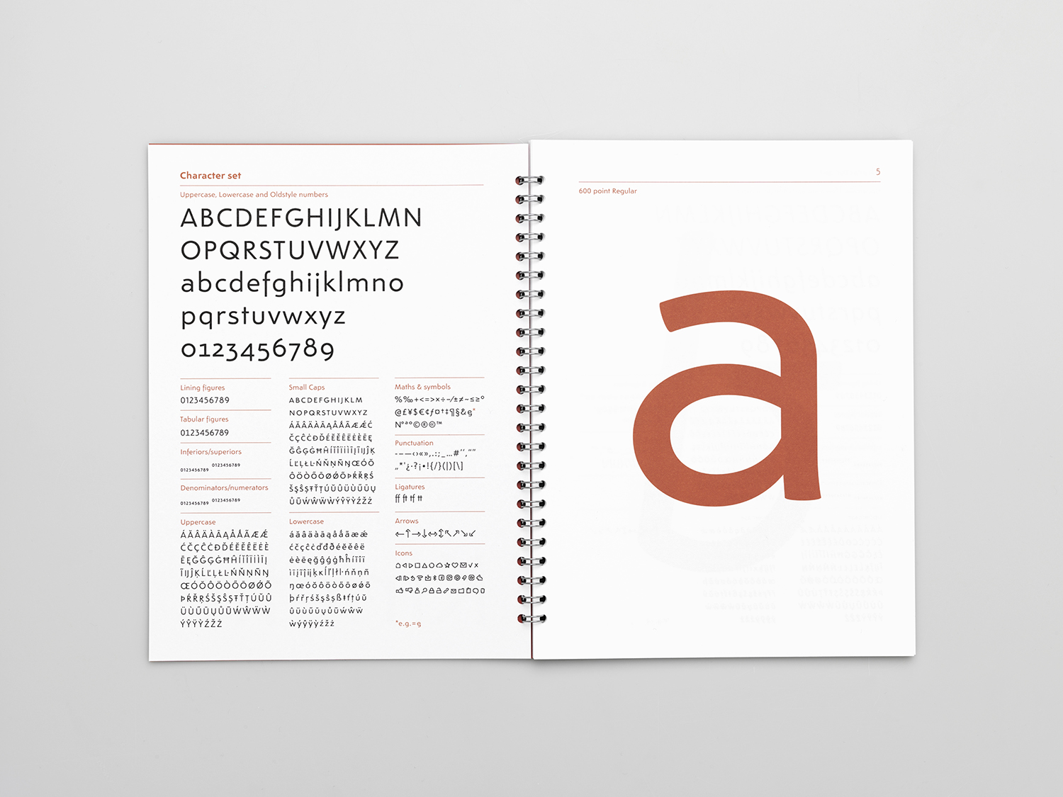
Kinetic is a typeface family created by María Ramos and myself. One of the main sources of inspiration for the design was the art of Alexander Calder. He started working with moving sculptures in Paris at the beginning of the 1930’s. The light, playful and soft appearance of Calder’s mobiles was something we wanted to translate into type forms.
The type family is appealing for contemporary typographic use, both on print and screen. The design is intended for a wide range of applications which include advertising, editorial design, and any corporate or art project.
The project was awarded the certificate of typographhic Excellence at the Type Directors Club. For more info please visit the Kinetic typeface site.
→ Article on Eye on Design.

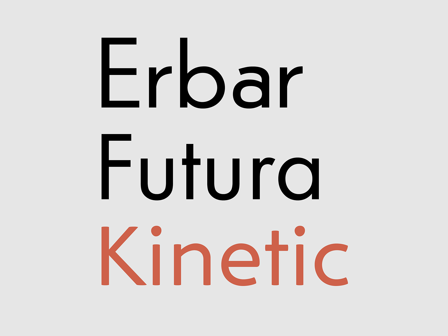
An organic geometric sans-serif
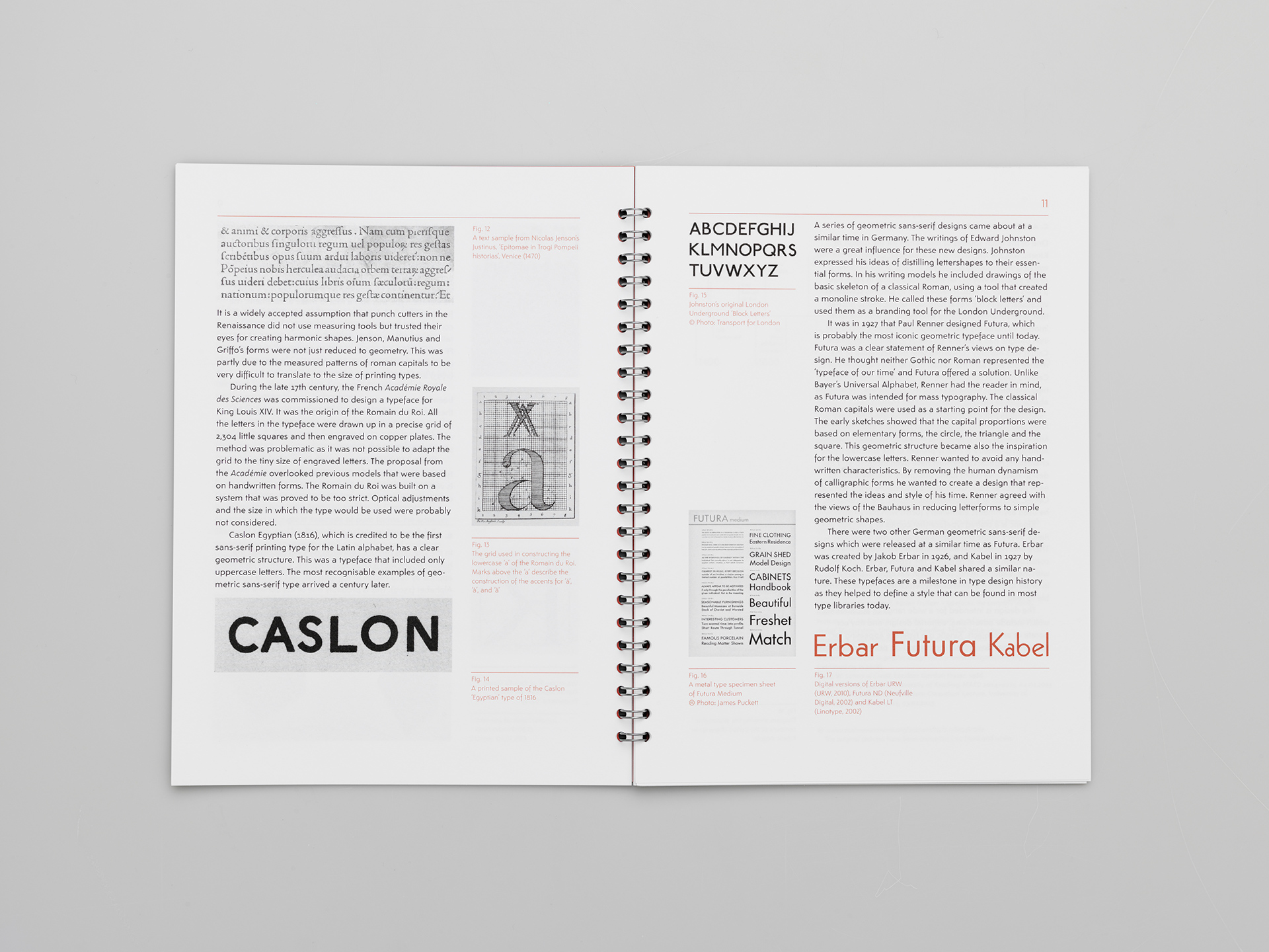
Kinetic avoids strict design patterns. Although geometry is clearly present in the simple structure of the characters, optical corrections have been included and there is room for interpretation in the design of each particular character.


Kinetic is a crafted design that comes in 3 weights with italics. The text typeface was created with the reader in mind. Kinetic is a functional and modern typeface that feels comfortable to read.


Kinetic Notes
The app is for creating text notes that allows you to use the typeface family Kinetic in your mobile phone. You can edit, highlight, delete and order your notes. Three Kinetic styles are available with the app: Regular, Italic and Bold. It also includes a custom keyboard that gives you access to a set of icons.
→ Download on the App Store.

